Health-Tech Design System
Scaling a web and mobile design system for a growing health-tech startup.
Client
CuraOS, a SaaS startup in the Medicaid space, seeks to modernize the paper-based industry by introducing web and mobile solutions. The primary focus is on empowering agency employees, particularly Direct Support Providers (DSPs), involved in Medicaid client care.
Problems
The lack of a design system created inconsistent user experiences & increased design and development time.Customers had complained of accessibility concerns such as insufficient color contrast and small text sizes.
Outcomes
Created a design system based on our front-end library with sufficient color contrast & documentation to streamline our processes.
Background
During my first week at my new job, I encountered what had been semi-used as a design system.
Looking at our web and mobile applications, the lack of a design system showed. There was inconsistent spacing, colors, and components all over the place. What I knew was terrible for design upkeep was even worse for our users.
Transitioning into a design team of one, I needed to put in work up front to make design-developer collaboration more seamless and create a more consistent user experience.

My Approach
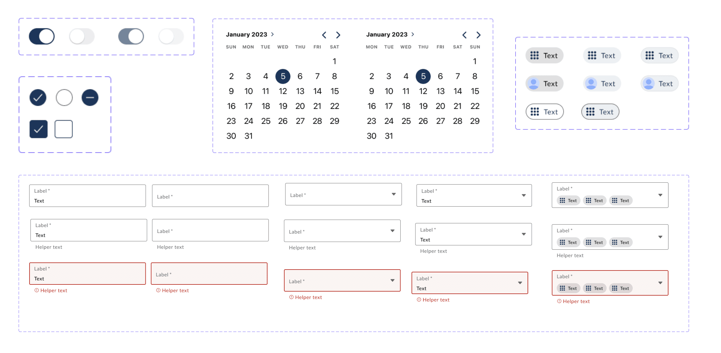
First things first, we needed to ensure our engineers would spend time on the customization that mattered.
Since our developers were using the Ionic front-end framework, I imported an Ionic Component Library file and themed it according to our brand. I did away with many of the colors in the previous design kit, relying mainly on our Primary blue color and shades of grey to keep the colors simple and easy to interpret.
To keep it simple to start, I did away with the components I knew we would not be needing in the near future, keeping our design system as lean as possible for the time being.
Accessibility
One of the problems we had heard from our customers was that there were a lot of unaddressed accessibility concerns within the mobile and web application. This, no doubt, came from a weak design system. To combat as many accessibility concerns as possible, I used a few accessibility tools during the creation of the design system.
My favorite during creation is the Stark Accessibility tool, which helped with issues such as color contrast (both WCAG and APCA) as well as touch target size.

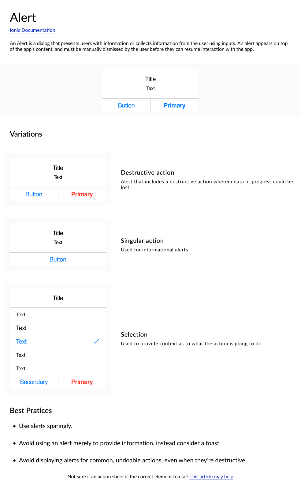
Documentation
A design system consists of two essential components: the actual design elements and the accompanying documentation. While the components make up one half, the other half is dedicated to documentation, which serves to assist both designers and developers in effectively implementing the components within the design system. This documentation proves invaluable, allowing me to concentrate on addressing design challenges rather than dwelling on the specifics of how to use a particular component.
I used a documentation template that was taught to me by my former manager — thank you, Clayton!