Scaling Support for Medicaid Services
Scaling CuraOS's mobile application to support a many-to-one ratio of clients to employees.
Client
CuraOS, a SaaS startup in the Medicaid space, seeks to modernize the paper-based industry by introducing web and mobile solutions. The primary focus is on empowering agency employees, particularly Direct Support Providers (DSPs), involved in Medicaid client care.
Problems
CuraOS's mobile app only supported a 1:1 client-to-employee workflow, limiting the functionality our customer base could use significantly.
Older users had a lot of trouble navigating the application due to low contrast levels and small fonts.
Outcomes
Redesigned mobile app to streamline many:1 client-to-employee workflow, allowing for more adoption and broadening our customer base.
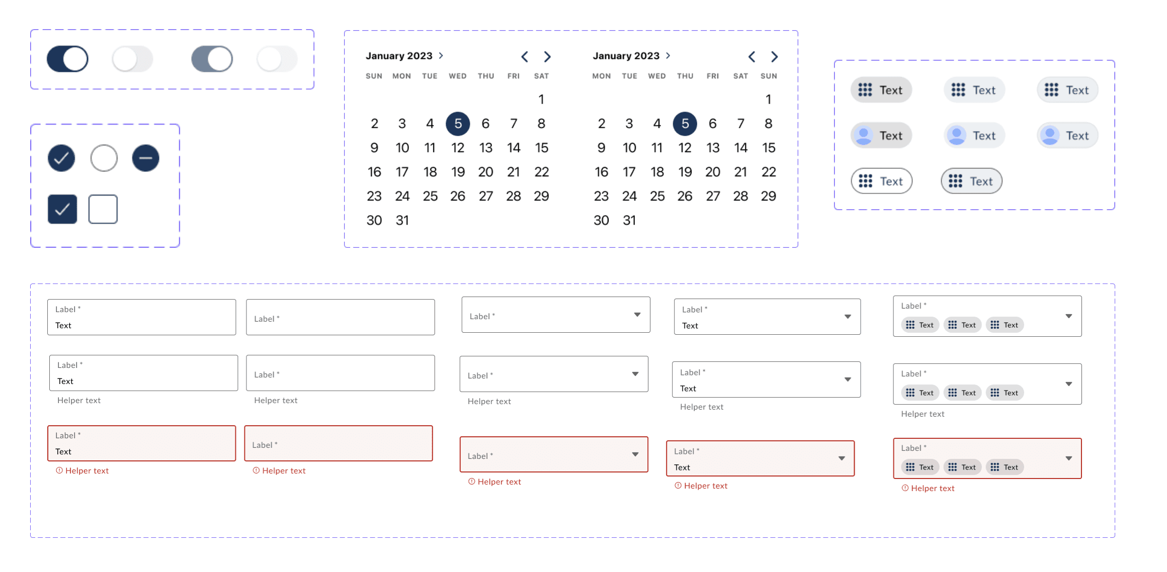
Increased color contrast across the app and created a more consistent visual heirarchy, reducing number of accessibility concerns.
Background
As CuraOS grew, so did the needs of our customers. Our mobile application had previously only supported a 1:1 relationship of Direct Support Worker and client. This relationship is not reflective of a large percentage of our customer base, so to scale, we needed to support a “many-to-one” relationship.
The project involves a comprehensive mobile application redesign to address challenges associated with the "many-to-one" relationship between Direct Support Worker and clients in the Medicaid sector. The overarching goal is to ensure thorough documentation while prioritizing efficiency, allowing DSPs to concentrate more on delivering exceptional care.
How might we alter the flow of the mobile app to accommodate employees who are working with multiple clients at once?
Understanding the Problem & Finding Opportunities
Our main problem was being able to support the same kind of mobile documentation for all visit types for our customers.
Currently, because 1:1 shifts are supported, customers would have to switch back and forth between mobile documentation for these Medicaid clients versus paper documentation for any shifts that involve more than one Medicaid client. As a business, we were worried about customers not being able to adopt our solution fully and falling back to paper documentation.
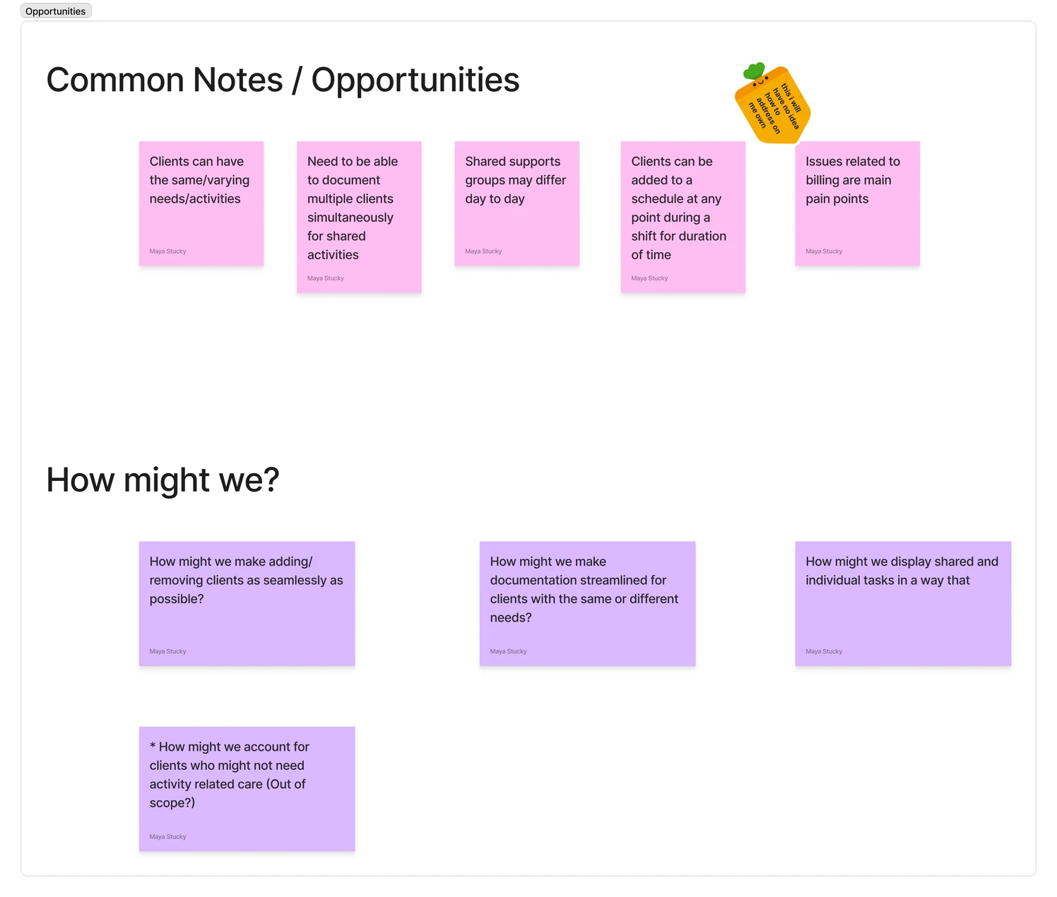
To set ourselves apart from paper documentation, we needed to find additional areas of opportunity for our solution. Leveraging Teresa Torres's Interview Snapshot method, customer interviews provided crucial insights including:
Workshopping & Ideation
As a design team of one, I found it necessary to schedule a workshop to enlist the brainpower of other Product people on my team. I asked that two of my team members come prepared with at least one idea on how we might tackle these problems, and then we would vote on what seemed like the best path forward given the current pain points and scope.
Since a Direct Support Worker would be required to accomplish a certain amount of tasks with a client in a given day, document status, and add notes, my mind kept going to project management software like Asana.
Validation
Validation included presenting our designs to internal stakeholders, SMEs, and external customers for feedback.
Customers were excited about the changes to the app and said the changes seemed “very user-friendly.” Of course, this is impossible to prove without actual user testing sessions.
Much of the accessibility concerns could be tested to a large extent using WCAG best practices, but it would have been nice to do some accessibility (and user) testing with end users.
Reflection
If I had time to continue with this project, I would do more usability testing. One of the difficult parts of working with a startup a lot of the time is that we often ship projects and learn from our mistakes. While there is nothing inherently wrong in this, it leaves a lot out of the UX Process. Additionally, as this was my first time designing for mobile, there was a little bit of a learning curve for me.
This project sets the foundation for future enhancements and scalability, with potential improvements informed by user feedback and industry trends.


